arXiv.org (pronounced “archive”), a non profit in academic publishing, needed a library of reusable illustrations for presentations and diverse communication materials. We knew the illustrations would be reused in multiple context so needed to be flexible. They also needed to resonate with our global community of scientific researchers.
I developed an informal style that is gently humorous, and appealing to the egalitarian and thrift conscious moral code of the academic environment. As a non-profit working within academia, communication materials must avoid any semblance of “slickness” or salesmanship. The bright blue ties into arXiv’s branding, but as a secondary color it complements rather than overwhelms the primary branding.
While sophisticated to produce, this style conveys an informal feel that suits the audience.
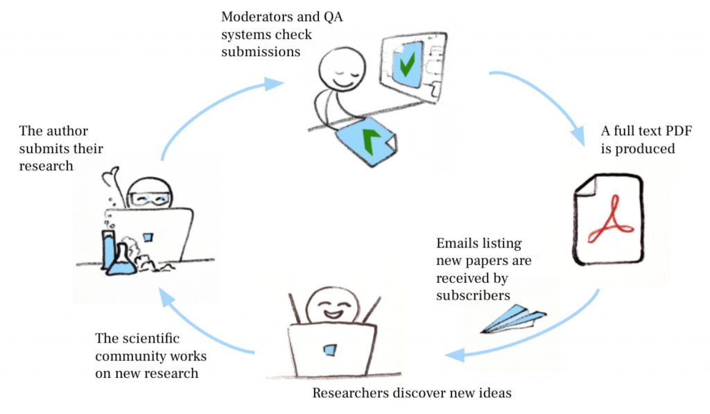
Because it is so collaborative—far beyond the usual transactional nature of most services—arXiv is difficult to understand. The illustrations help bring to life the individuals and processes that make up the open science publishing cycle at arXiv:

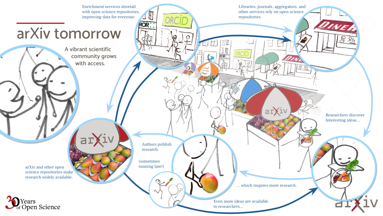
When arXiv was making the business case for expanding interoperability, the metaphor of an actual marketplace—an old fashioned human friendly farmers’ market, open to all—highlighted the immediate benefits to the community and clarified the connections between related organizations in our field.
The following illustration was used by our Executive Director as she pitched and built support for the organization’s focus on improving APIs to support interoperability:

This informal style serves arXiv well: It is flexible and easy to expand on; It supports the message that we are approachable, budget conscious, and humanist; We also actively show appreciation for our audiences’ time by communicating complex topics in a simple illustration.


