The accessibility of scientific research papers is incredibly low; according to researcher Lucy Wang less than 3% of PDF papers meet accessibility criteria (Wang et al.). At arXiv.org we set out to better understand the accessibility landscape of research, where these barriers are taking place throughout the user journey, and what our role should be in improving accessibility.
Interviews and analysis
As part of our research we interviewed over 45 researchers and accessibility experts. After transcribing our interviews we broke them down into observations, then documented them following Atomic Research principles by mapping each observation to a step in the user journey, and wether the experience was positive or negative.
Our findings were powerful and clear: access to research for those who rely on assistive technology is an overwhelmingly negative experience.
Making the user journey accessible
As I prepared artifacts to share them with our community it was especially important that the artifacts themselves be accessible. Researchers with disabilities have been incredibly generous with their time and expertise during my research; the least I could do is share back what we have heard in a format that is accessible to all.
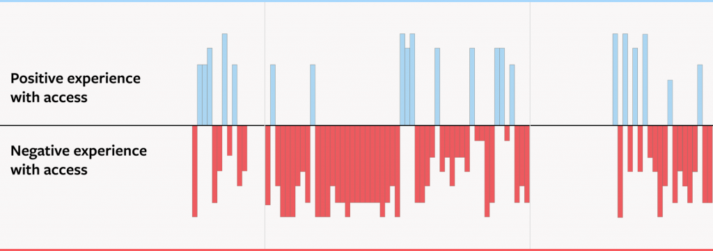
I determined on a simple table layout to present my findings. Tables can be highly accessible and navigable when the formatting is straightforward. My table-based layout begins with an introduction to the size and layout of the paper, to assist all users in building a mental map of the content. Straightforward text with minimal formatting fills most cells. Only the center row displays visuals—a positive/negative bar chart broken down into five steps—and each image is accompanied by lengthy alt text descriptions describing both the intent and the numeric results represented.
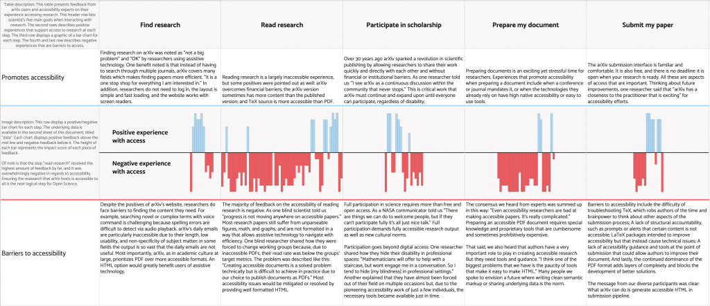
A bar chart would not normally be accessible. Most user journey layouts are also not parseable in a linear fashion as required by screen readers. But by designing my output as a simple table I was able to accommodate both sighted readers and those using assistive technology. In addition, I took the advice we heard regarding all research, and included our underlying data. This was a special bonus of already working in a table format: it was very easy to add a second sheet with our (anonymized) feedback and semantic layering.
Here is the final, accessible table layout. The user journey and all underlying (and carefully anonymized) data are publicly available to view and reference.
(I was inspired in this work by Brigitta Norton, an accessibility specialist based in Canberra, who encouraged me to extend the use of tables in my work. Thank you!)
Reference:
Wang, Lucy, et al. “Improving the accessibility of scientific documents.” arXiv, 2021. arXiv.org, https://arxiv.org/pdf/2105.00076