Shamsi Brinn, MBA, is a design leader with over 12 years experience experience leading UX/UI for enterprise products.
User needs are the northstar of a united team. I use my diverse experience in project management, design, and leadership to build great products with great teams at less risk. Deep design and user research experience combined with an MBA provides the foundation for balancing business objectives and user needs. Advanced functional prototyping skills allow for clear translation of workflows and enhance collaboration and communication. Strong advocate for accessibility. Below are select examples of my work and process.
Leading teams with No Handoff
At the heart of processes like agile is risk reduction through iteration. It has transformed software development, but has left critical parts of the process out: discovery, design, and business strategy. The No Handoff method addresses that by bringing all stakeholders together, iterating on the same deliverable in regular cycles.
We have been artificially fragmenting processes like research and design into their own silos for a long time, with outputs from the Product team often built around a handoff process to Engineering. Engineering in turn may handoff to an operations team after a certain ‘done’ increment. Iterating together brings many benefits and reduces risk.
Design has a strong tradition of iteration. The Double Diamond process dates back to a UK Design Council study from 2007. However, Double Diamond and Agile processes are rarely seen overlapping.
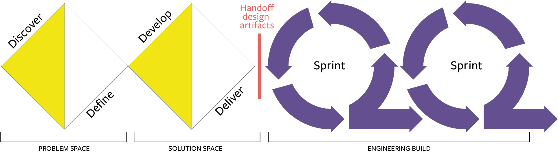
No Handoff breaks down siloes by iterating as a team. The grounding principles are simple:
- Foreground user needs as our shared northstar
- Iterate together, and
- Prototyping is our shared language
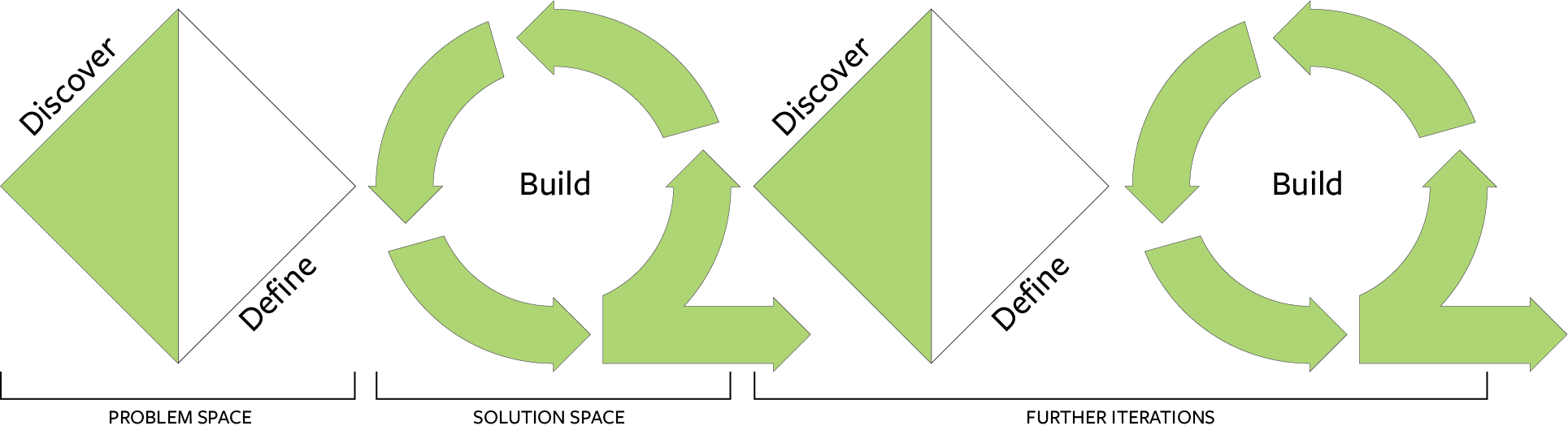
Prototyping is a simple (not easy) catalyst for transformative change. It is a shared language that all stakeholders understand without interpretation or leaps of imagination. A working application, however rough and simple, invites everyone into a substantive discussion on complex digital interfaces.
Discovery, design, and other processes integral to successful software can adopt the process of iteration too. Prototyping is the catalyst for working as one team and moving beyond project handoff. In my work, No Handoff has proven to be more efficient, enjoyable, and user focused… and much less risky.
Re-branding to protect a legacy institution
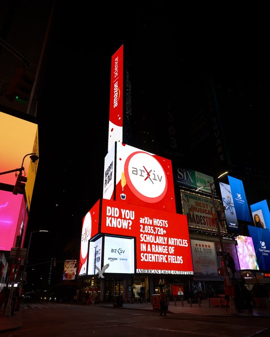
Starting in spring of 2021, I led a diverse international advisory group on a re-branding journey. arXiv (pronounced ‘archive’) is the world’s leading open-science repository for research papers.
arXiv’s identity was in widespread use by third parties across a confusing array of products leaving this critical scientific infrastructure in danger of misunderstandings or even misappropriation by commercial interests.
I led our advisory group to explore arXiv’s legacy and discover our northstar then worked with a design team to build a meaningful and protectable identity around it.
The ‘Chi’ mathematical symbol at the heart of arXiv’s name is created from intertwining arms representing the connections and catalyzing of ideas that this service enables.
The new branding came to life in time for arXiv’s 30th anniversary and was featured as part of Amazon’s Pi Day celebration in Times Square.
UX Research: making academic papers more accessible
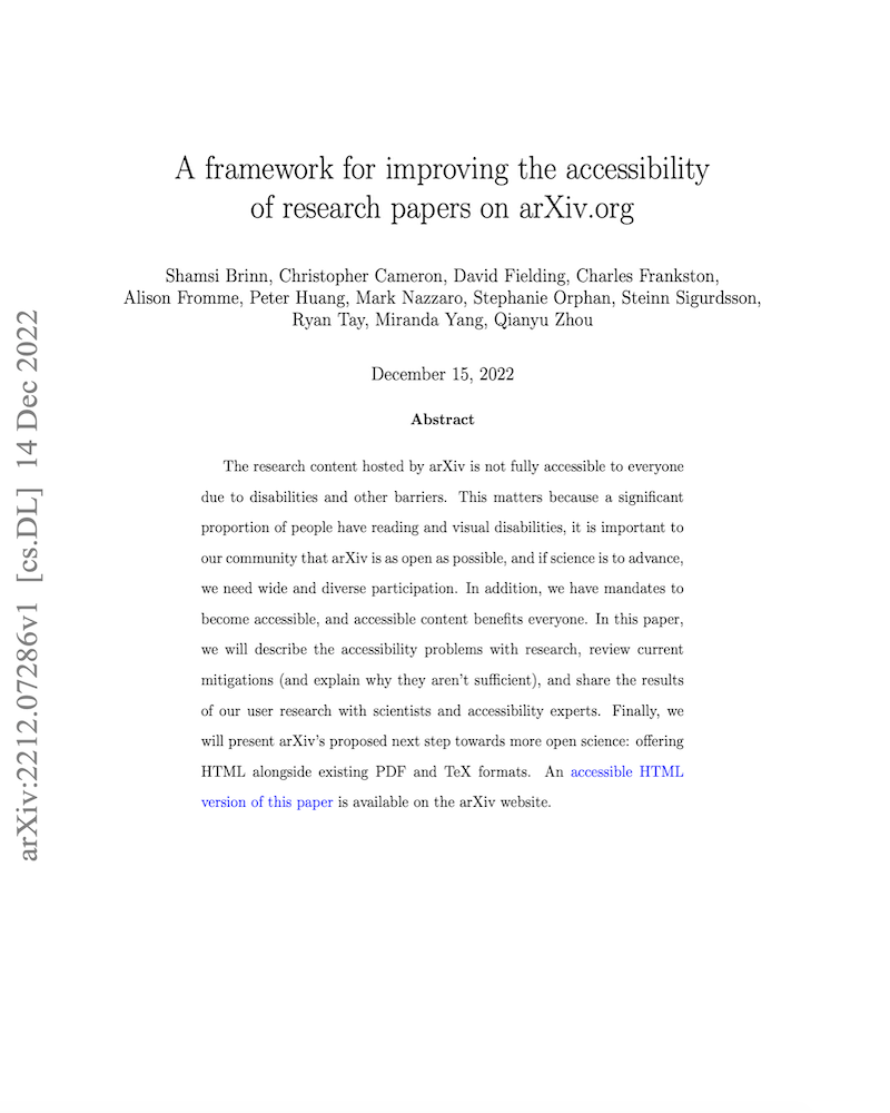
Research papers across academic fields have extremely low rates of accessibility, leaving many scientists without equitable access to the research content they rely on. Leading a team of students and staff, I set out to understand the experiences and barriers faced by STEM researchers who rely on assistive technology, and the technical challenges that any solution will need to overcome.
After conducting 46 user interviews and running a survey with users of assistive technology, we analyzed and gathered our findings into a paper to share with the academic community.
We found many of the accessibility issues stem from the monopoly of the PDF format in scientific research, and would be remediated by offering HTML. Despite the significant technical and cultural challenges to be overcome, an impactful solution is achievable with the technology available today.
Read the full paper at https://doi.org/10.48550/arXiv.2212.07286
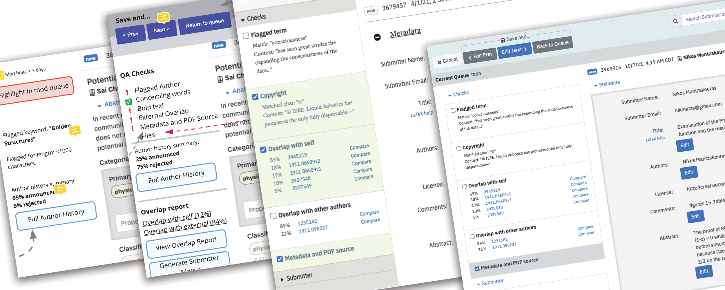
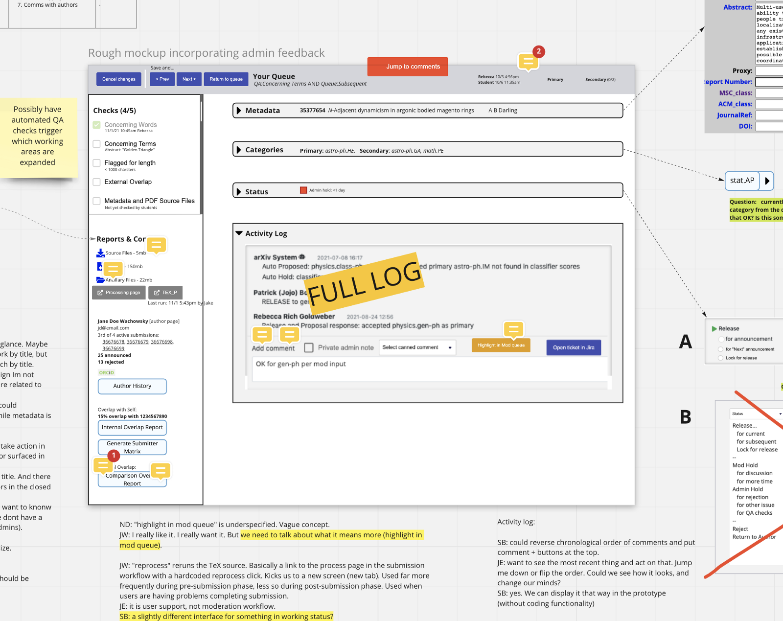
Co-creating new customer support tools
This internal Customer Support team needed a single interface to accomplish all of their tasks, replacing a collection of legacy tools and bandaids that had not kept pace with their growth. Applying No Handoff principles, we began with an intense research phase that involved the customer support team and all other stakeholders who would have decision-making power over the project.
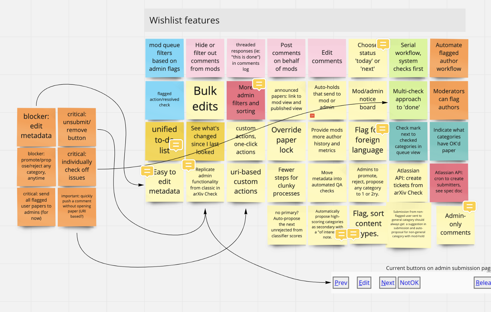
After briefly defining our goals and primary targets, we dove into wireframing. Whiteboarding rough mockups focused each discussion around functionality in a language that everyone can understand.
Whiteboarding wireframes can include notes and feedback from stakeholders, captured for future reference. 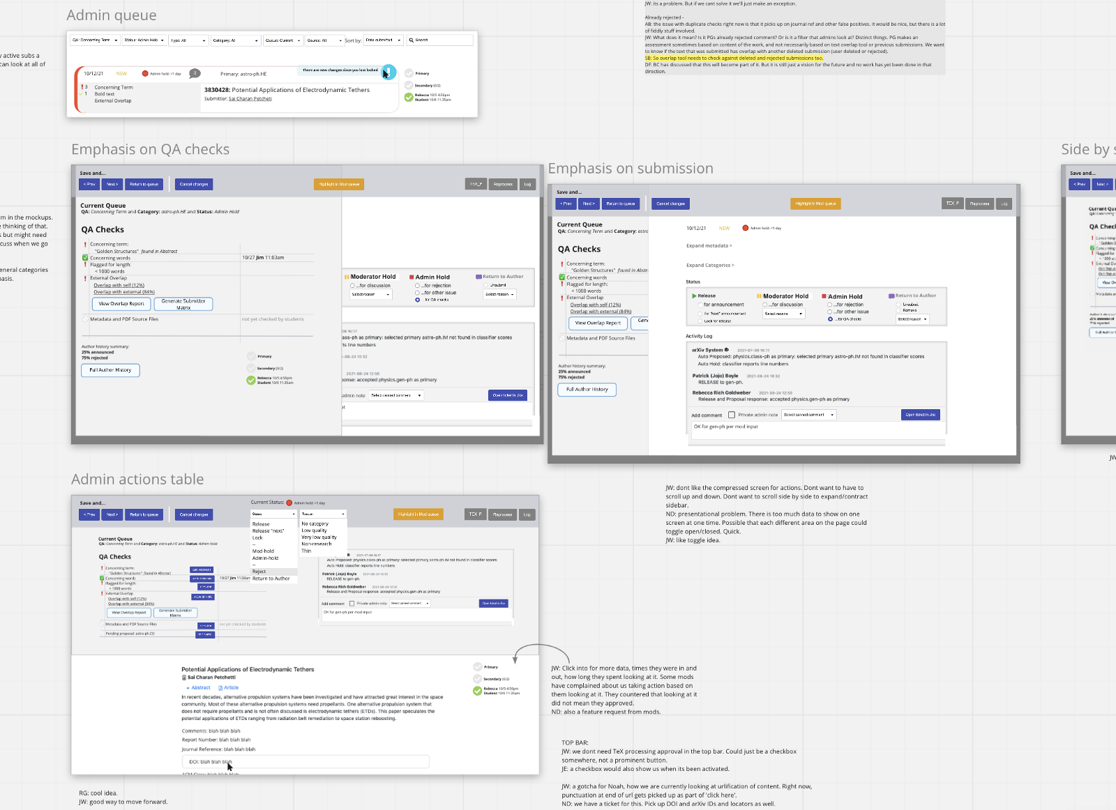
As wireframes become more refined, final layout is not the goal. We focus on content, hierarchy, and documenting functional needs.
From mockups we moved directly to prototyping. Iterating on a functional prototype from early days allows both product and engineering to contribute to the same product and iterate towards releases together.
In an early prototype, layout decisions are focused on basic functionality and content hierarchy. 
In a later iteration, stylistic elements are layered over existing functionality.
By making incremental improvements that involve the entire team AND the end user every step of the way, there are no surprises to throw off steady progress. Cycles of feedback, iteration, and testing progress seamlessly, without handoff between product and engineering.
And by centering a prototype as the source of truth—which everyone can understand without interpretation—the experience of the end user guides the work done at every stage.
Building an accessibility user journey… that is also accessible
This user journey is based on research conducted with scientists who rely on assistive technology. The least I could do was to share what I had heard back in an accessible format. All too often our design and research outputs focus on the visual to the detriment of other needs, but with a little creative use of tables this user journey infographic is highly accessible to all users.
This user journey uses a simple table layout, contextual descriptions, useful alt tags, and a splash of color to assist sighted users.
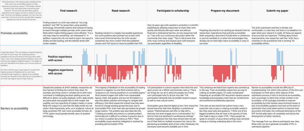
Tables can be highly accessible and navigable when used correctly. Accessibility consultant Brigitta Norton inspired me to consider how to expand their use in my work. My table-based layout begins with an introduction to the size and layout of the paper to assist all users in building a mental map of the content. Straightforward text with minimal formatting fills most cells. Each image in the center row is accompanied by lengthy alt text descriptions describing both the intent and the numeric results represented. View the accessible table and underlying data here
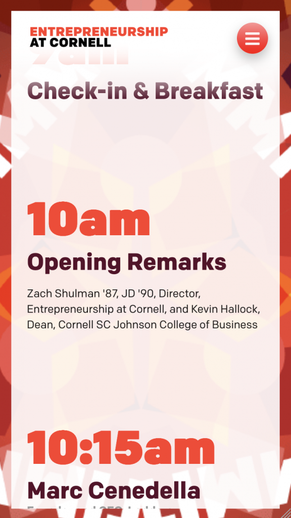
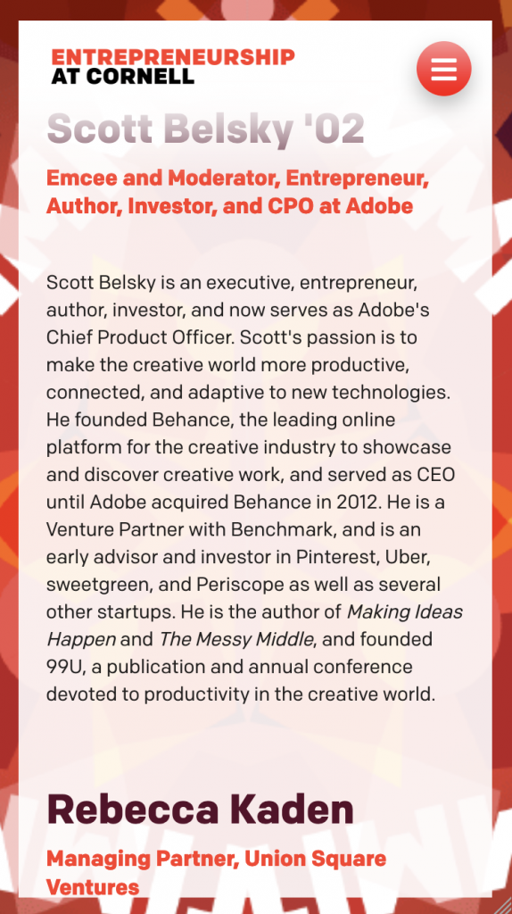
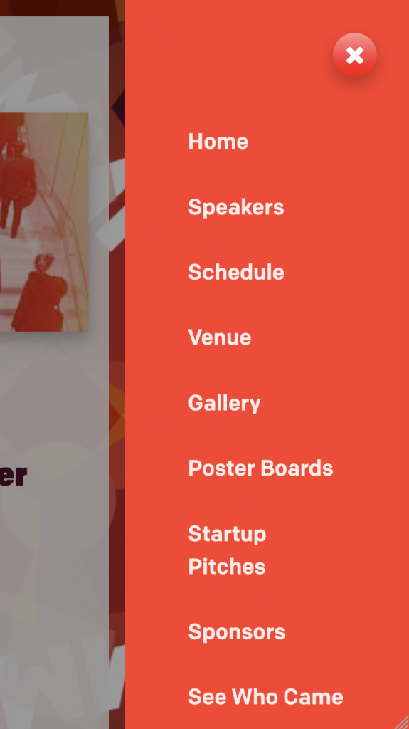
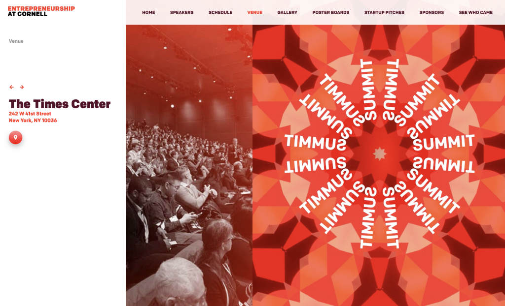
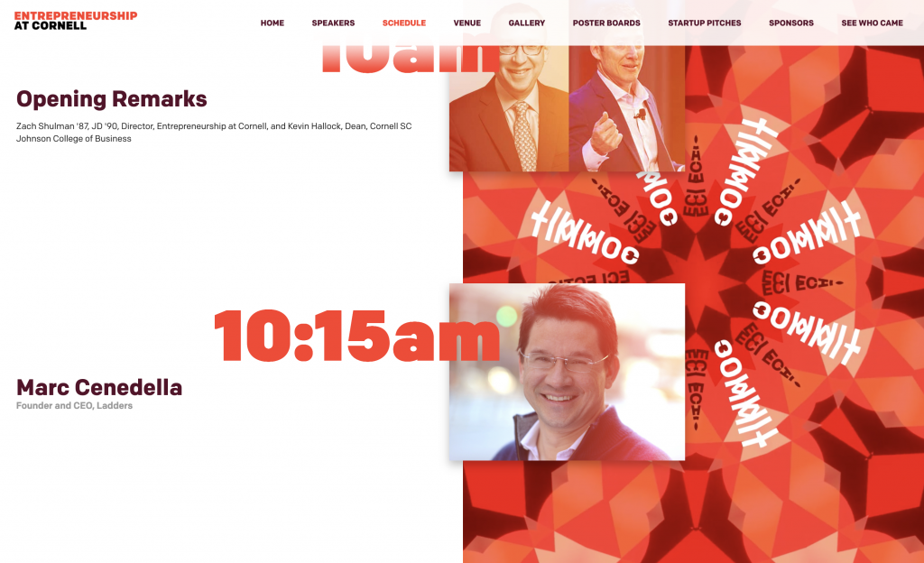
A vibrant website for a dynamic conference
Entrepreneurship@Cornell hosts a conference each year to showcase new ideas and leadership in the entrepreneurial space. This website is from Summit 2019, just before Covid cancellations hit. Moderated by Adobe’s Scott Belsky, the Entrepreneurship Summit is a dynamic event that calls for a vibrant website full of color and surprise.
With it’s sun-washed palette and mesmerizing kaleidoscopic animations, the website beckons you in and provides a taste of the energy you will experience in person.

Without large areas for animation, the mobile version layers a vibrant background behind the content instead. An animation would reduce legibility so engagement is achieved through color and typography.