
Using ‘No Handoff’ to integrate design and development.
Background
We are all familiar with project handoff: that universally hated period of inefficiency, disruption, and blame. Your precious work gets thrown over the fence, or you catch something that doesn’t make sense and have to do it anyway.
Agile practices disrupted the handoff between developers, leadership, and the end user. But the handoff between designers and developers is still going strong. At it’s core, agile delivers working software in shorter iterative cycles. But the discovery processes (UX, design) don’t yet have a home in that pattern.
No Handoff is a working pattern I have developed to close the gap between product and engineering. This case study illustrates an ongoing project where we are using this working pattern to deliver working software iterations together.
Project Description
We needed to replace the multiple legacy tools and hacks used by a Customer Support team with a single interface where they can accomplish all of their tasks. We wanted to disrupt our usual project process of discovery and design on one side, and development on the other. Instead we want to involve all roles in the process of delivering incremental working software, and avoid a handoff stage.
Getting started with Discovery
In agile projects, discovery is assumed. For this project, we did not yet know the scope or specs and we began with user research. I often use UX as a verb: an activity undertaken by the UX role of course, but also by dev, management, and end users. User needs are our northstar, the glue that bind us all together; discovering them is a shared responsibility.
Our development team follows a standard two week sprint cadence. Discovery adopted that pattern too. Over a series of meetings we dug into the pain points the Customer Service team was facing, what had been tried in the past, and their vision for the future.
Whenever possible, members of dev and management took part in interview discussions so they became invested in the product on a user-focused level, too.
We reviewed UX findings every 2 weeks in a shared Miro board, where we capture notes and research findings. The entire product team AND the end users all have access to review and edit this board throughout the project.
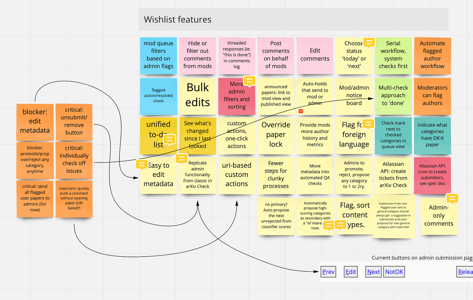
The shared board is our primary method of distributing UX research and insights. By co-creating it with the end users and the product team from day one we establish transparency, trust, and a shared understanding of the project. It also sets the tone for the extreme transparency that is critical to success.
The Discovery deliverables: A shared and evolving Miro board.
Key concepts: UX is verb, not a role; Practice extreme transparency with a shared space for working on and distributing UX insights.
Low Fidelity Mockups
After several rounds of UX research and analysis we have a better picture of the scope, and can move straight into low fidelity mockups. Mockups are throwaway work, so we keep them rough and basic and move through this phase quickly. We use them as a way to validate our UX findings and converge on direction, but not to work on design.
We kept working in our same shared Miro board, using a mix of their wireframing tools and screenshots to quickly visualize functional changes.
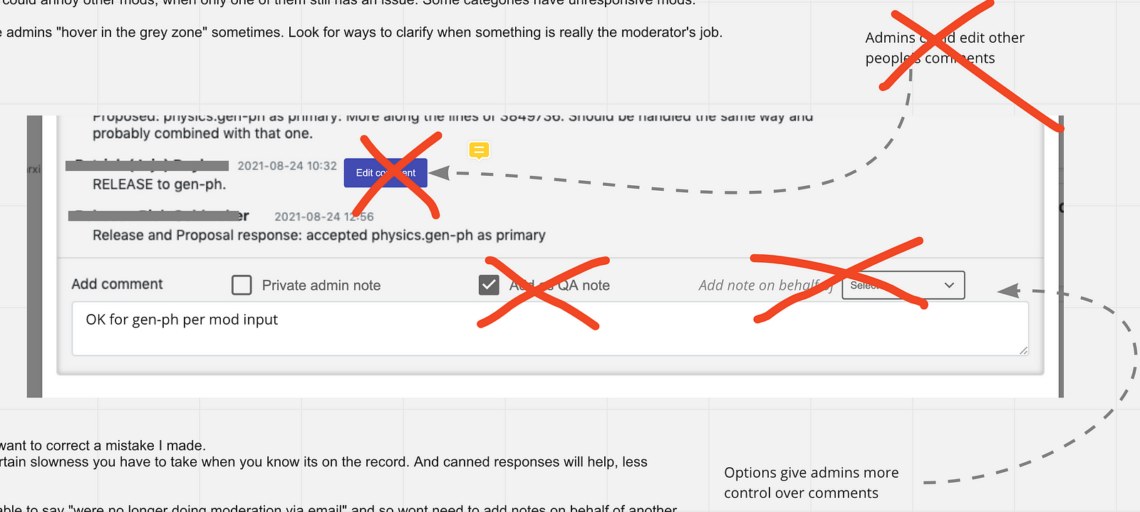
I like to adjust mockups during our discussions. It is both efficient and a great team building exercise to co-create with our end users in real time.
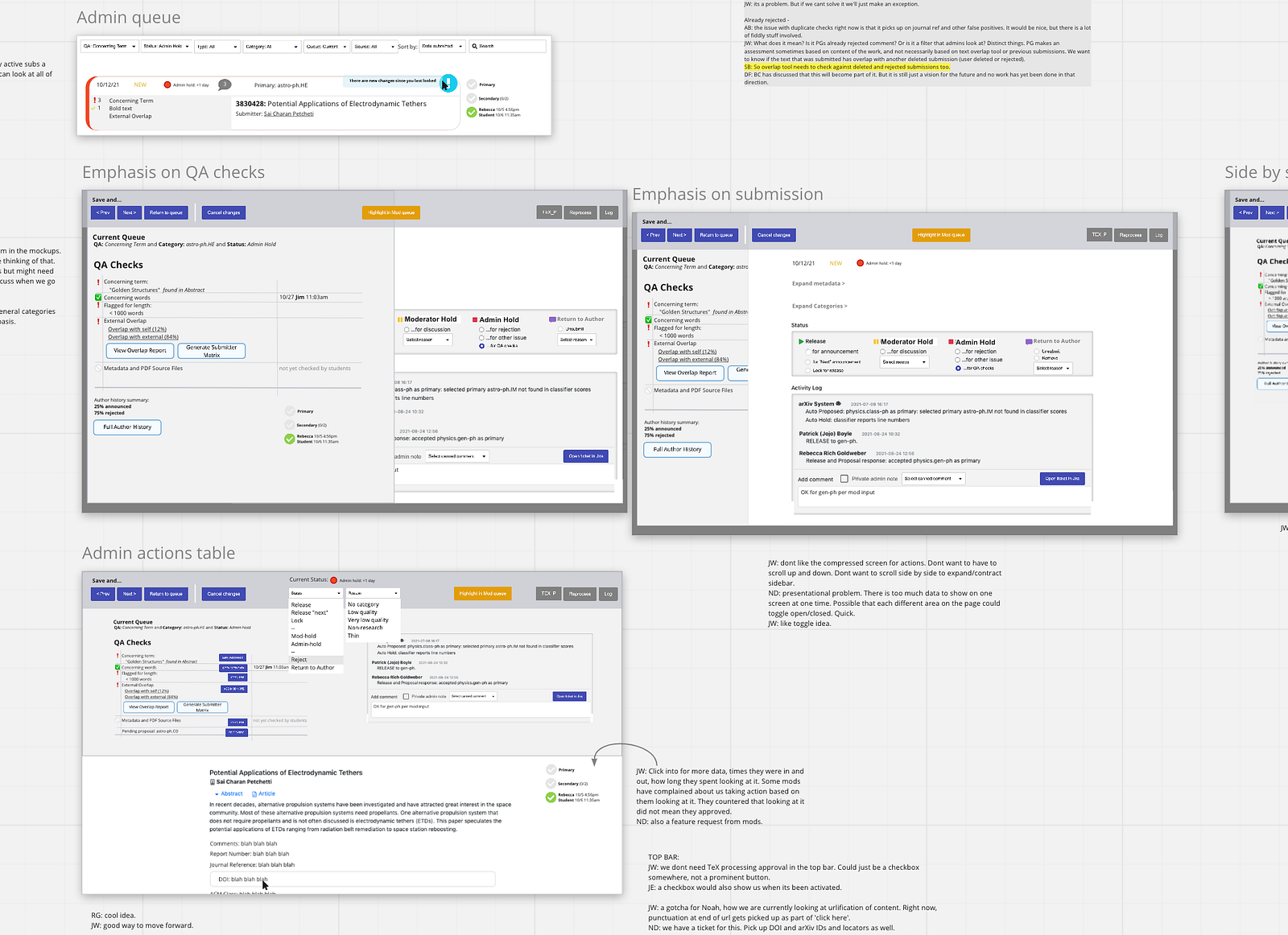
This stage of visuals is in fact the foundation of more detailed specifications to come, so it is critical that developers are involved. Here is an example of how an insight immediately became a specification because we were all present together:
User: “I sometimes need a way to call a moderator’s attention to an urgent submission. If I just write a message they might not see it right away.”
UX: “I’m adding a button in the mockup right now, next to where you write your messages. The button will make it a top priority in the moderator queue.”
Dev: “OK, I see that button. The API will need to be updated to support it because that functionality doesn’t exist right now.”
We then create a stub user story in Jira for that API work. Down the road, when we get to development, we will have a head start on the specifications and they will already be written in the shared language of Jira tickets.
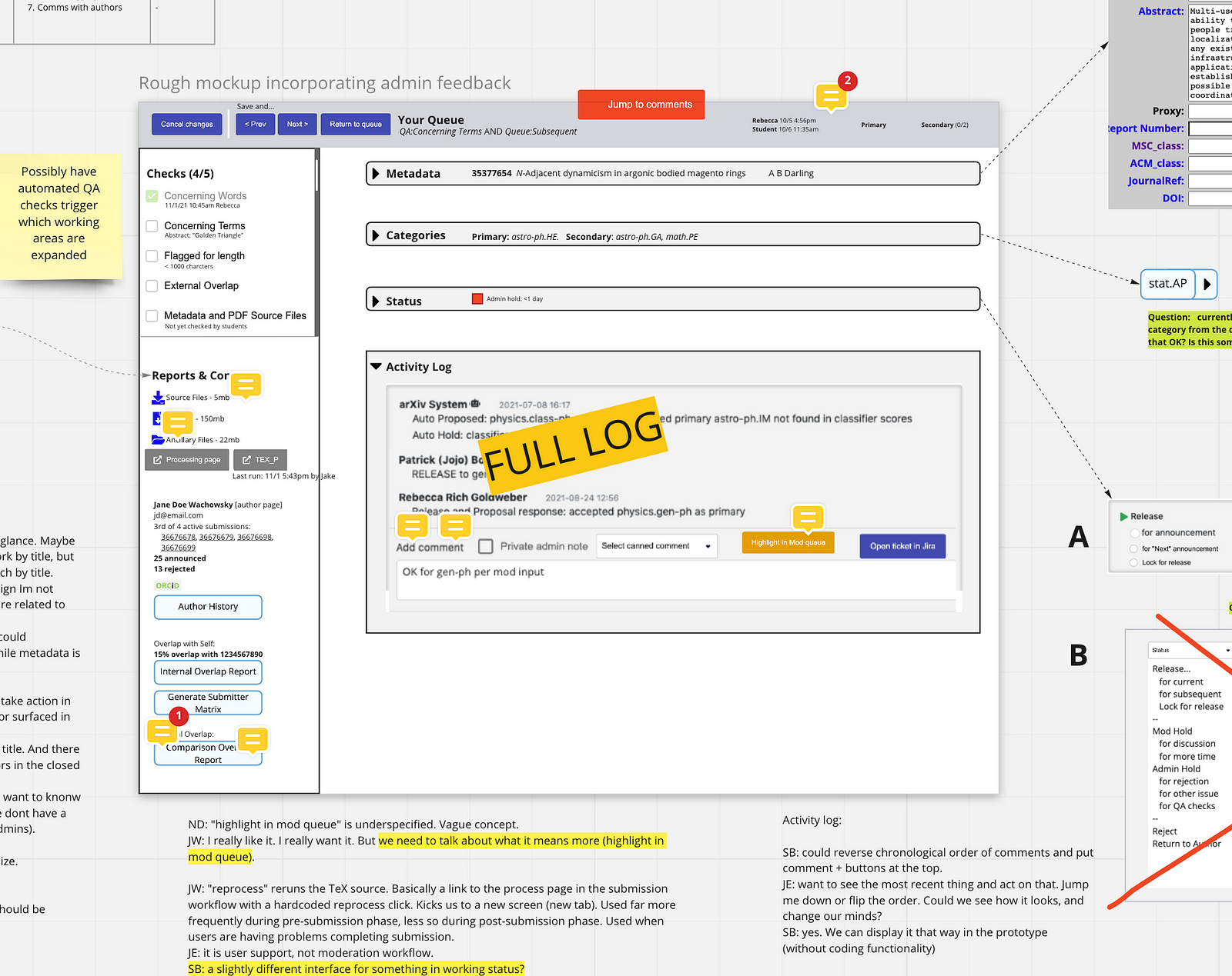
The Low Fidelity deliverables: Low fidelity mockups; Stub Jira tickets.
Key concepts: Keep the mockups ugly, nobody should be swayed by the power of design yet; Continue to share everyone’s contributions in a public and visual way.
Prototyping
Once a rough mockup and some specifications are co-created by the team we move right into prototyping. This is where we will work for the rest of the project, including deployment. The prototype is the project.
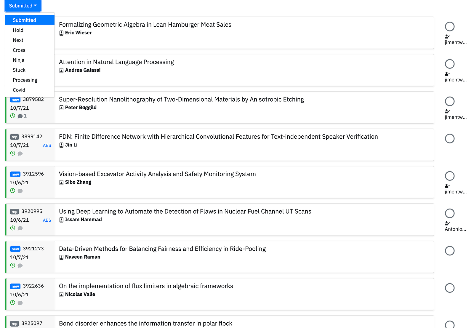
The prototype is also our primary shared language. Wether they come from a design background, are an end user, or have programming knowledge, everyone just gets it.
To make things easy we prototyped in Bootstrap. Functional wireframing goes fast and is almost a drag and drop exercise that can be done by members of UX and Design too, not just developers.
Be bold about sharing your work in progress. Testing and evaluating an incomplete product is part of the team’s learning process; it aids transparency and builds trust. You can see in the screenshot above that we only had one menu functioning. Not fancy at all, but the rough edges emphasize that we are co-building. At this early stage being unpolished is a feature, not a bug.
The Prototyping deliverables: A rough prototype with minimal front end functionality.
Key concepts: Focus on function, not style; Show incomplete work with confidence.
Closed Beta
After several review rounds of the prototype with the end users, we deployed an early iteration to the Beta server. The feedback we got was more confident and assured. For the end users, it always surprises me how viewing a prototype in their own browser and workstation can bring up fresh new thinking.
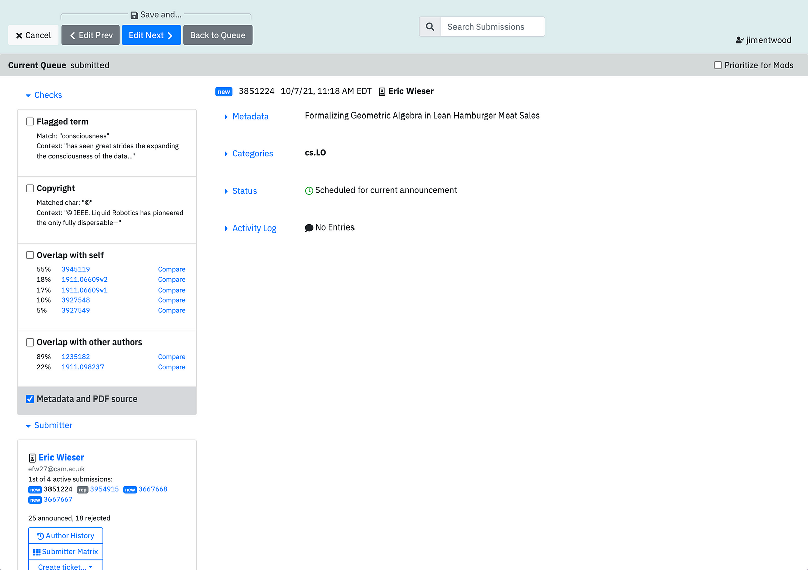
As an example, an initial filter for categories was hundreds of items long. We had asked how it could be better organized during the mockup stage and worked on some improvements. But once the end users could play around with the list in their own way, the feedback we received was: “I don’t need a list at all! I know these categories. I just need a type-ahead with hints so I can get the spelling right.” It makes me wish we had deployed even earlier!
With a closed beta it is easy to expand the pool of users to even more people, like leadership. Establishing a shared vision is an ongoing task and the closed beta is a good time to widen the circle.
The Closed Beta deliverable: Deploy the prototype for beta testing.
Key concepts: Further validate functionality; Widen the circle of users.
Design
Have you been waiting for this step? We’re finally here! In a No Handoff project, discovery starts early and stretches well into prototyping. The phase we traditionally call ‘design’ comes a bit later than usual (even though everything we’ve done up to this point is actually part of design as well).
The prototype is a fantastic design spec to work from. It is representative of what the end users actually need and most functionality is roughly in place. With that foundation designers can dive right into efficiency, usability, data density, and more.
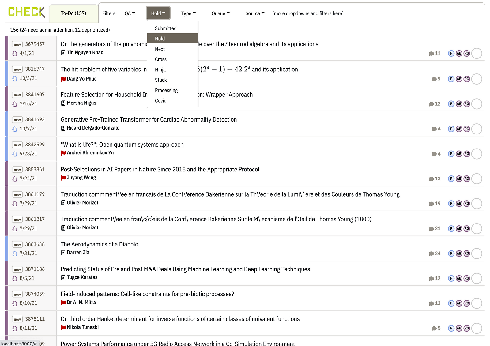
We can now hold design reviews within the prototype. Users can click around and intuitively understand the functionality being proposed. We don’t wait for design perfection but deploy often, flaws and all. Sharing work in progress continues to build trust and saves time.
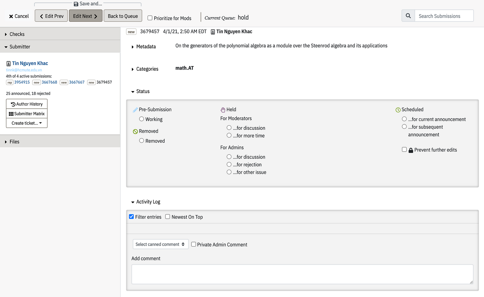
Rolling out design changes incrementally, and as part of the working software, helps the discussion remain on functionality and measurable experience metrics. Issues that have derailed my design projects in the past, like a stakeholder fixating on a color choice, can be leapfrogged by an incremental deployment and respectful focus on the function of design.
The Design deliverables: Deploy functional design updates to the beta.
Key concepts: Design is part of working software, too. So design changes are deployed iteratively and reviewed in the prototype.
Next Steps
The critical stages are described above. From here, we iterate through more design and development cycles, with all teams contributing directly and iteratively to the working software.
Our next stage is an Open Beta, another opportunity for further widening the circle of users and getting more feedback on the prototype.
One day we will have to stop calling it the prototype! This usually happens around the Open Beta. It is an organic, smooth transition though, with no handoffs from one team to another.
Key Findings
The No Handoff process bridged the divide between design and development, within the context of our development teams’ agile process.
1) The early focus on discovery builds trust, and continues to pay dividends with a deeply involved end user group: “Being able to go back to the shared board and see what we said before was really helpful. I knew I had been heard. And I could see how our feedback was being used.”
2) Our shared understanding of the user pain points led to more active protagonists willing to take risks: “I normally hate sharing unfinished features I’ve built, but Im getting more used to it. I trust this group to see past bugs and whatnot.”
3) Design and back end development were more aligned: “We didn’t have to pause on feature development to wait for a design, it was all happening at the same time. From watching the prototype come together I also learned more about design.”
4) Design can contribute directly to the working software, too: “Working towards a prototype update each sprint, I really felt like part of development for the first time.”
No Handoff is what we already know projects should be. It is a logical progression to expand agile practices to encompass the whole project team. With some tweaks and an expanded definition of working software, we can all be part of the same empowered team and contribute to iterative deployments.